What makes a person stop, think, and engage with the message that you want to convey?
It might be a complicated answer but it has been proven many times that people can have a lasting impression from a single image.
Let’s simplify the reasons why an image can spark interest in the viewers.
#1 Rule of Thirds
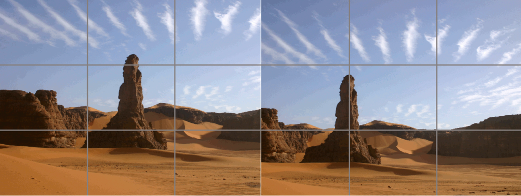
Tadrart01.JPG: Pir6monderivative work: Teeks99, CC BY-SA 3.0 <https://creativecommons.org/licenses/by-sa/3.0>, via Wikimedia Commons
The rule of thirds is a guideline that has been used by artists and designers throughout history. It is basically positioning the focal point of an image using an equal 3 by 3 gridline.
This technique makes use of the muted space to make the subject of the image stand out. It provides a better perspective of the subject by narrating the interest based on the background of an image.

Positioning a text to a certain point gives the viewer a clue about there is something going on in the next post. You can also use positioning to emphasize your message or call to action.
#2 Eye Tracking Patterns
We can only process one piece of information at a time. However, with a large number of images available online, your image must stand out in able to get your target market’s engagement.
An image must instantly provide the viewer’s needs because you only have a limited time to get their attention. The information must be carefully organized in order to guide the viewer’s perception. Use the following layouts to direct your audience to quickly absorb your message.
The Guttenberg Diagram
Our culture trained us to process information from left to right and from top to bottom. We have acquired the habit of acquiring information by following this direction.
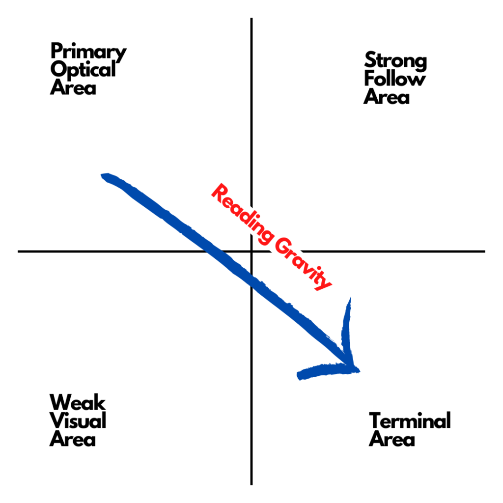
This has been applicable to both images with minimal content and images with lengthy content. Follow this rhythm to provide your viewer with consistency and maintain the focus of their attention.
Z Pattern Layout
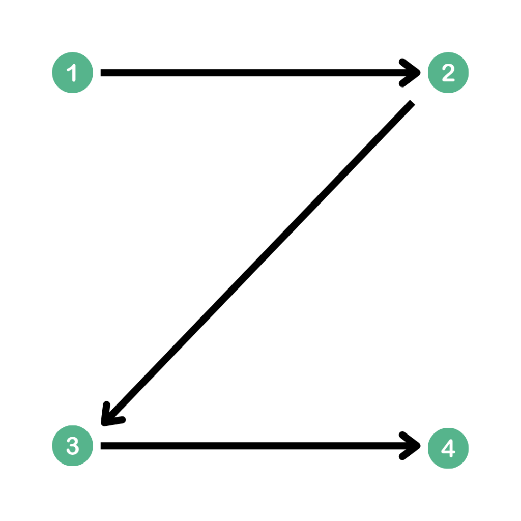
This has been the usual way most people acquire information whenever they read fast. The first impression starts at the top horizontal line. It is the best place to locate the message or the identity that you want to convey here.
Keep in mind that the goal is to guide the viewer to never miss out on the important details. It is not necessary if the bits of information or call to action comes first. Define the best opportunity to strategically place these elements. Note that the simpler the design, the more effective it will be.
F Pattern Layout
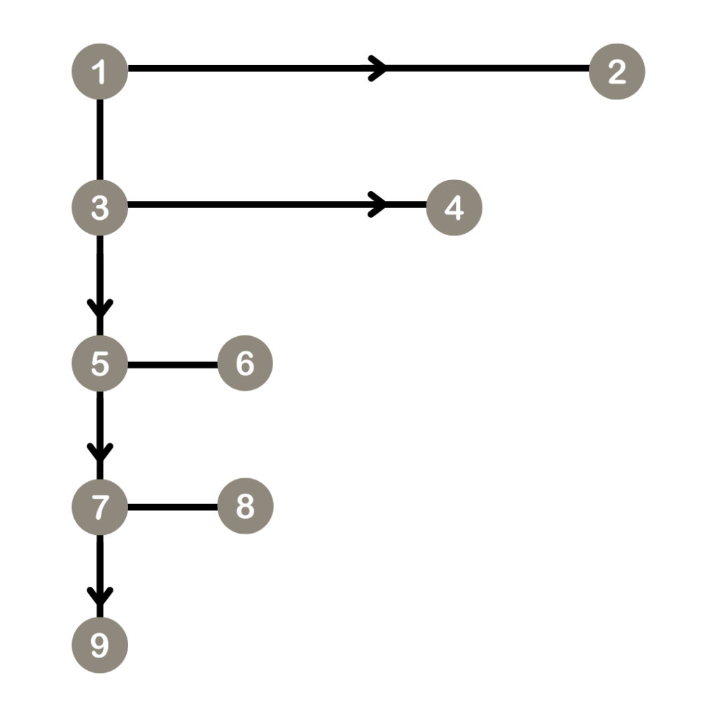
For images with lengthy content, the F pattern layout is an effective way to organize information. Note that you only have a few seconds to deliver your message. Techniques such as using bullet points or placing the important information on the right side of the grid can help your viewers absorb the message faster.
#3 Contrast
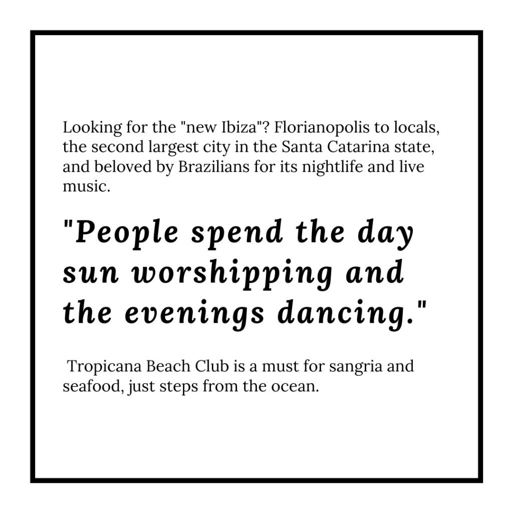
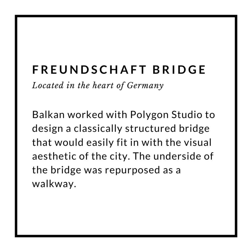
Font Size, Type Face, and Letter Case
These are the easiest ways to make a text stand out. Adding this distinction can give a better chance for the message to be read.
Color Combination
The color combinations can instantly make or break the effectiveness of your image. It automatically sets the mood and highlights the focus of your image. Use the right colors to make your text legible. Make the text pop by applying various colors from light tones against dark tones or vice versa.

The use of light and dark shades from a single color gives a monochrome combination. This works for relaxed and unified messages.

Neon Colors strike attention and provoke a faster response. A dark background can amplify the use of this color.
Font Style
The use of typography is the initial expression of your message before the viewer reads your text.
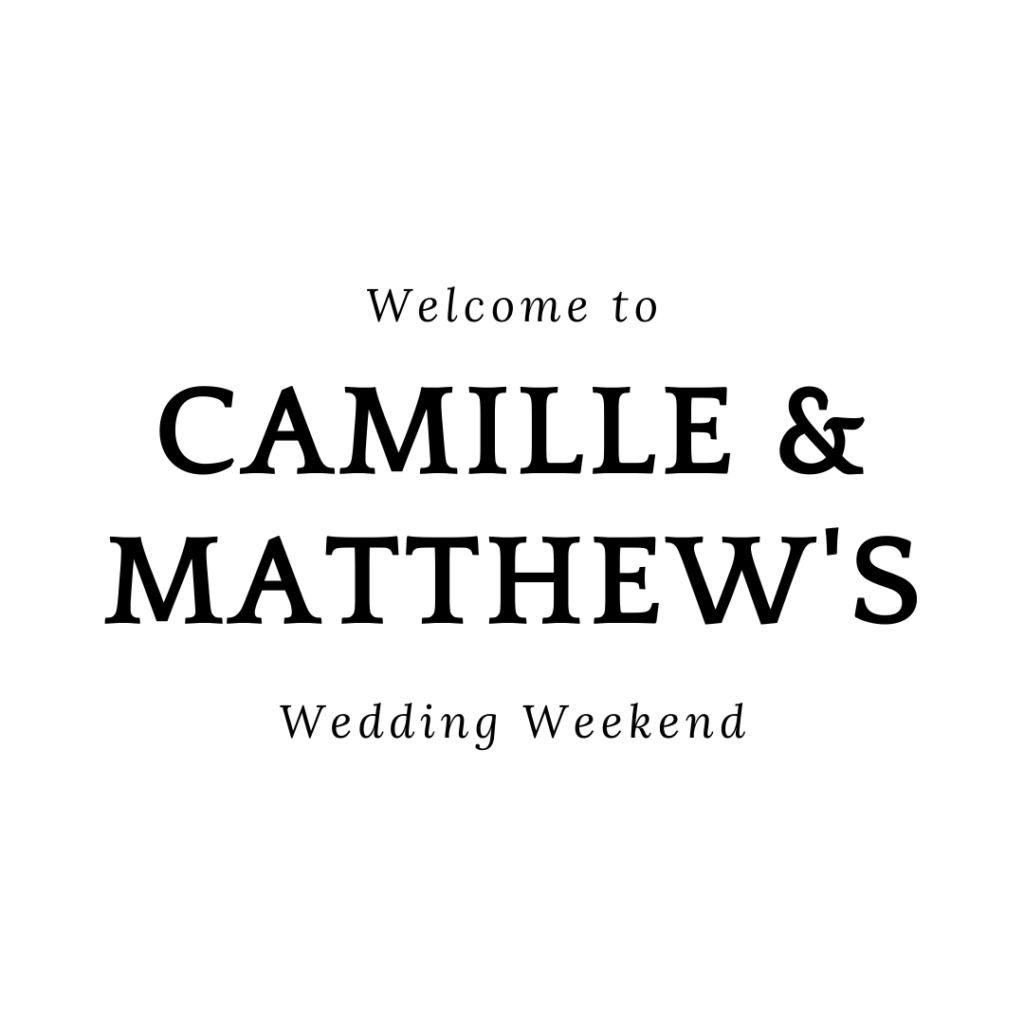
- Serif
Serif fonts are letters with decorative lines or tapers as an element of design. It is commonly used for words that need an authoritative or traditional style. Text in smaller font sizes is more legible in serif fonts.
- San-serif
A number of popular brands redesigned their logo in San-serif fonts. There has been a trend to shift into a clean and simple design. San-serif fonts efficiently cover the space and have a modern touch.

- Script
Script fonts convey freedom or a personalized message. This can definitely gain attention but make sure that it can still be read easily.
